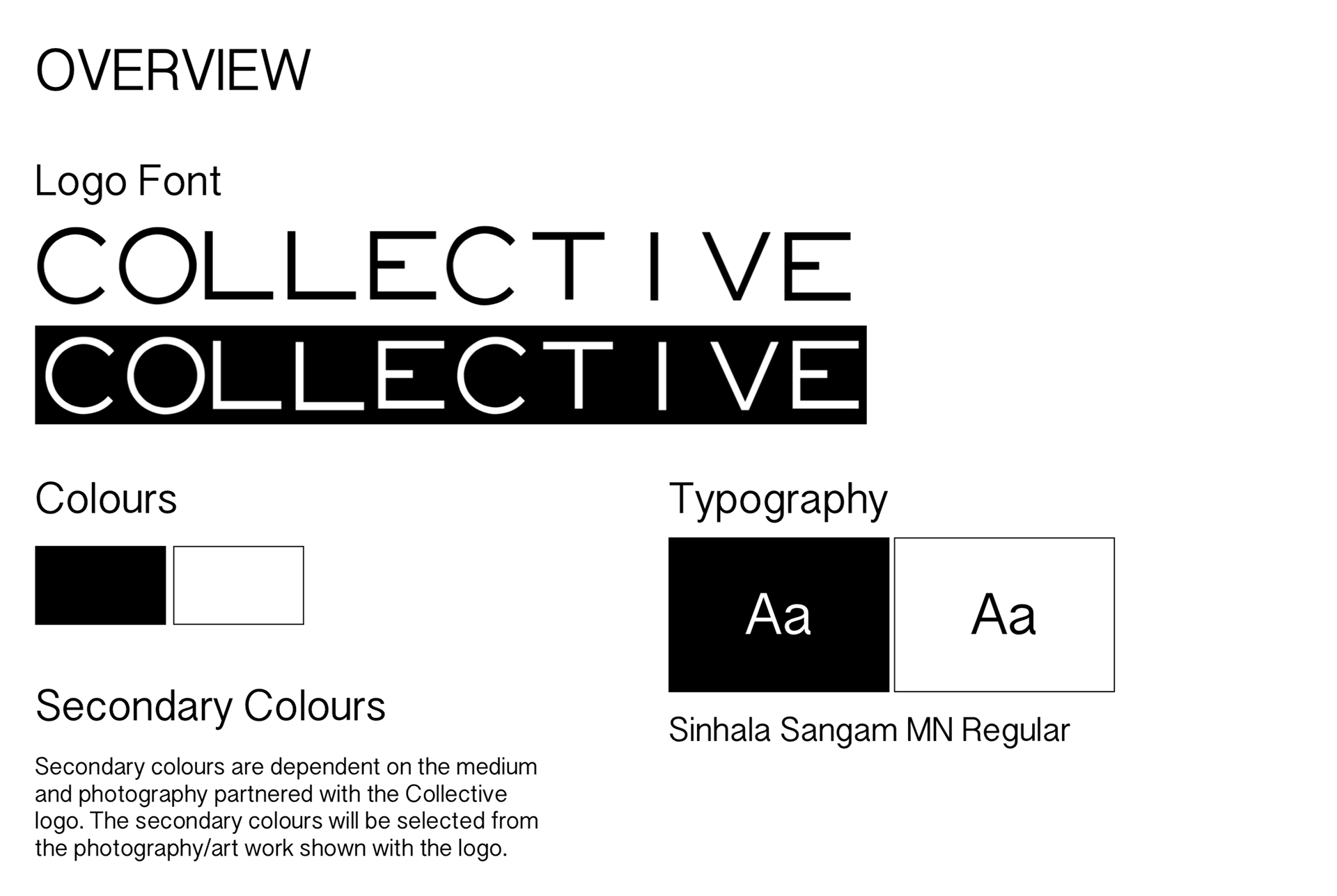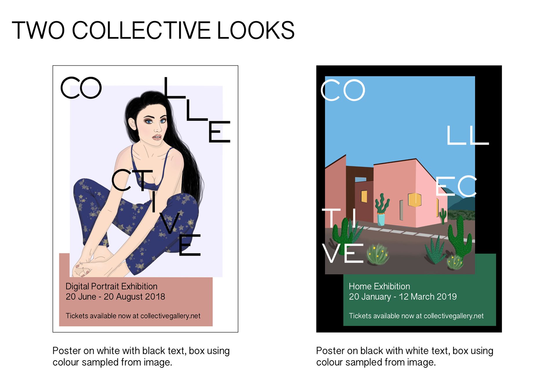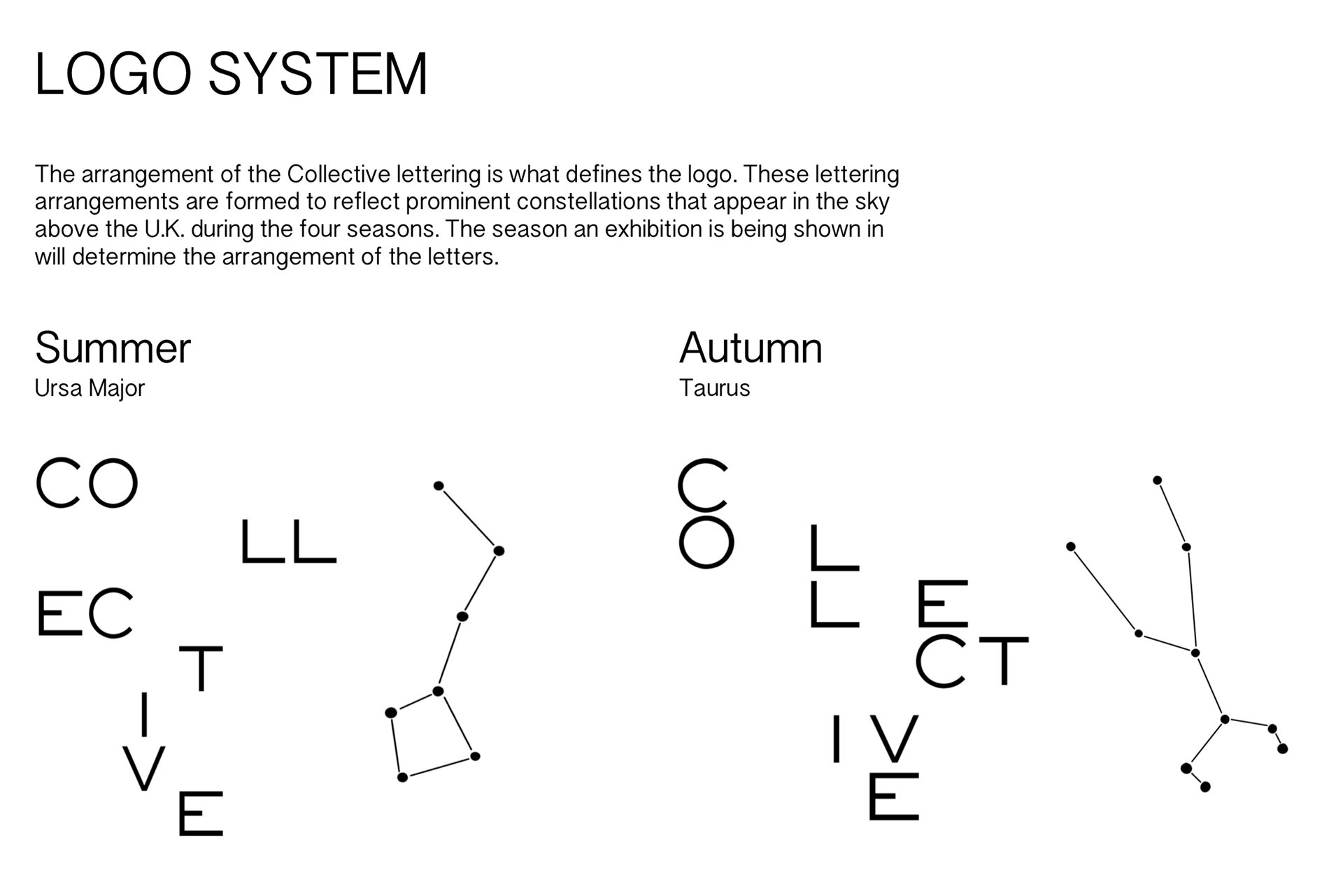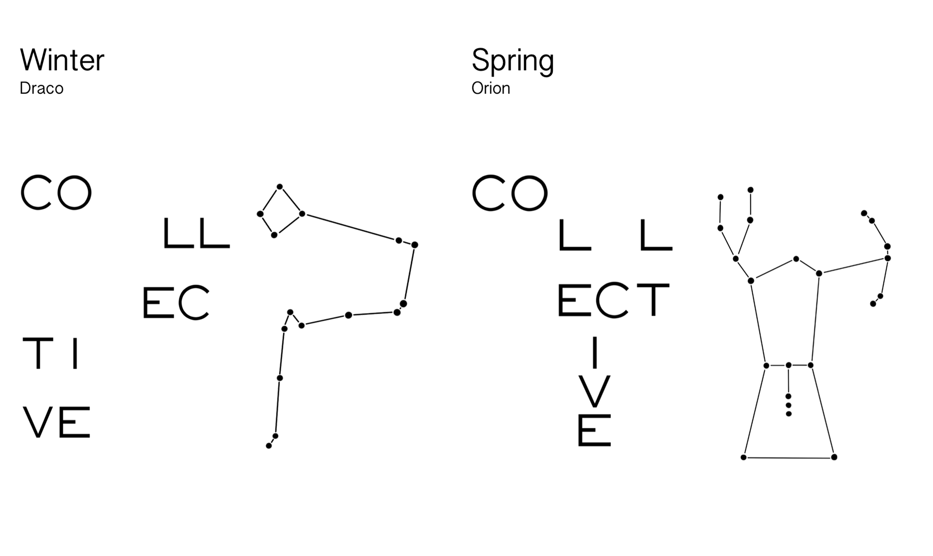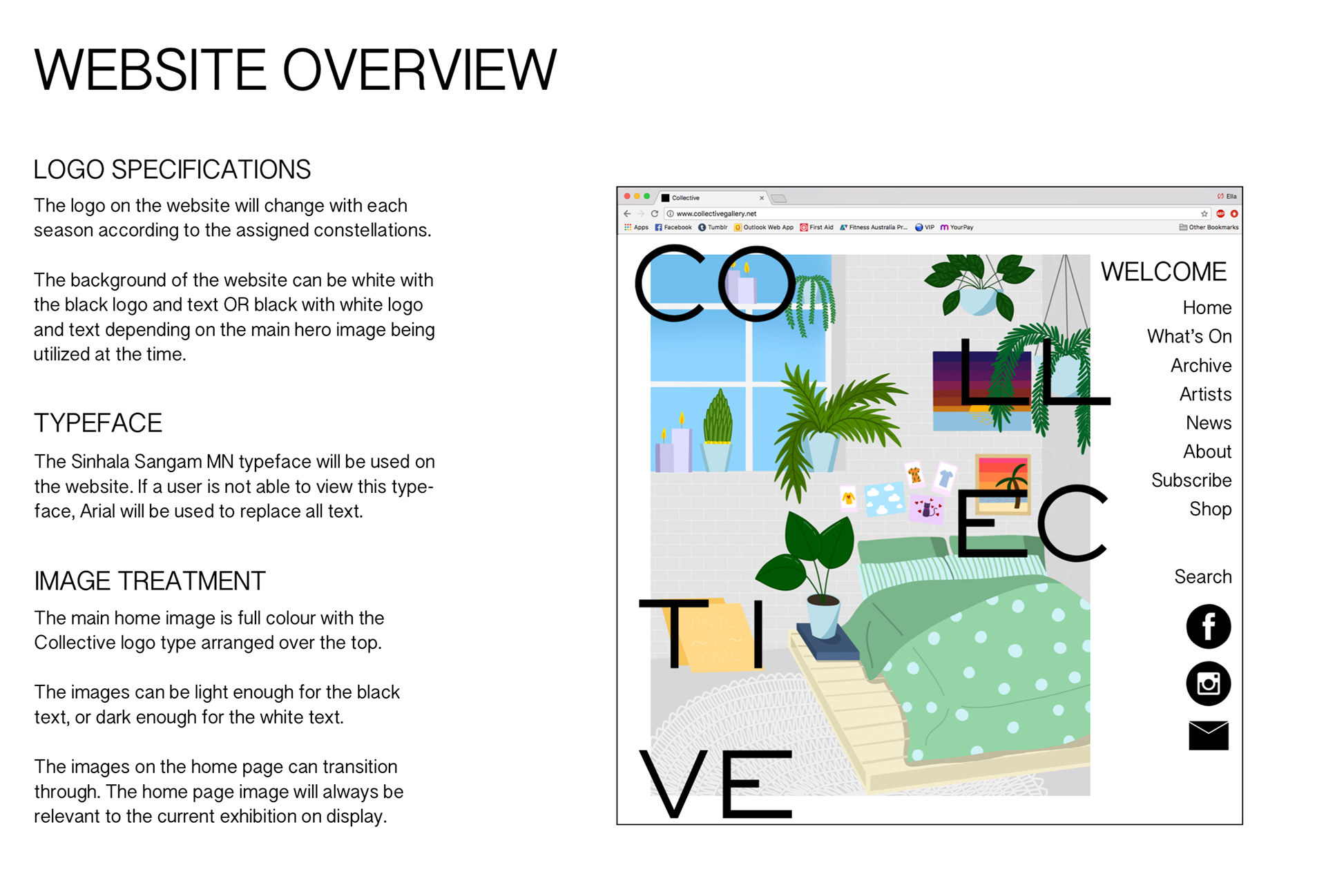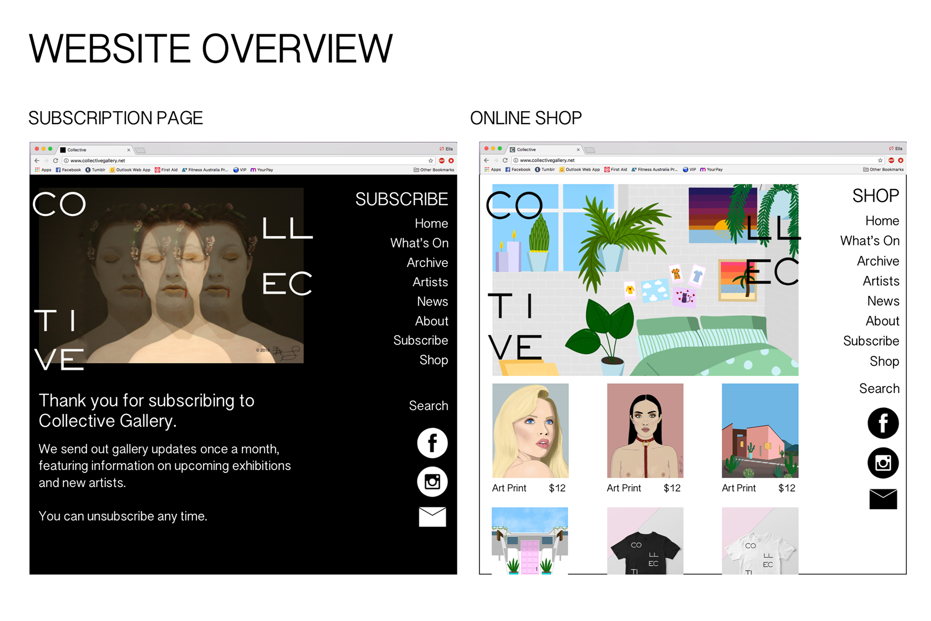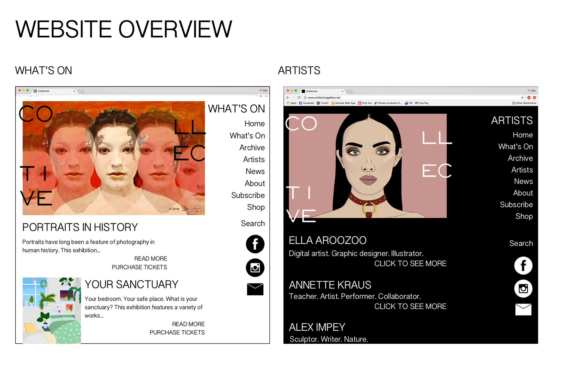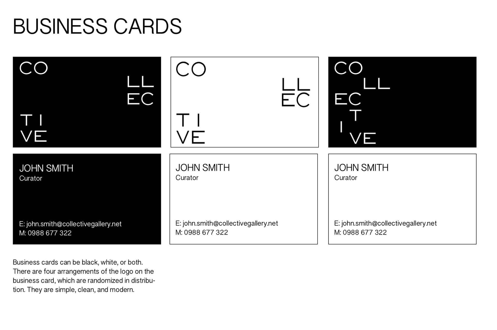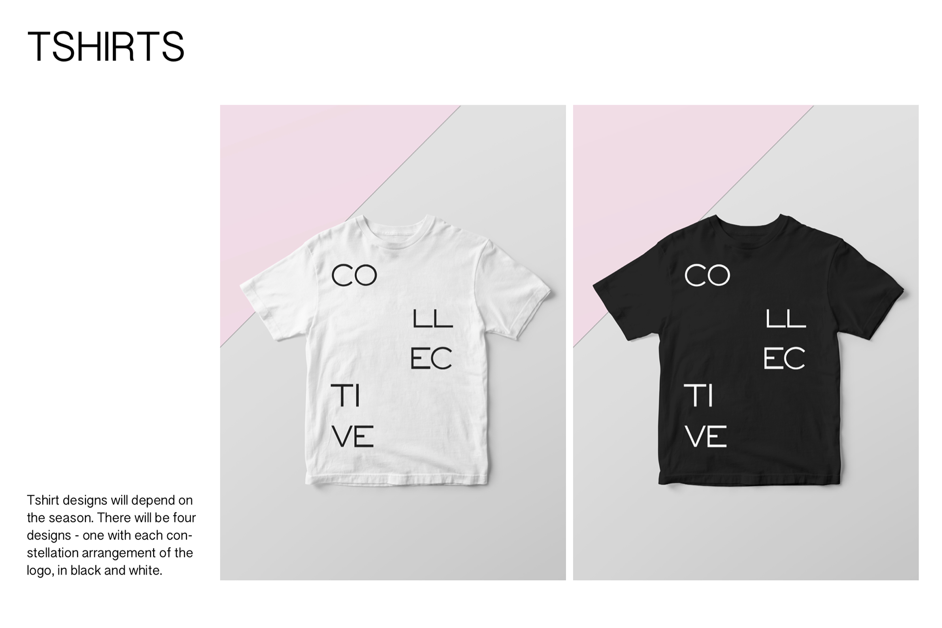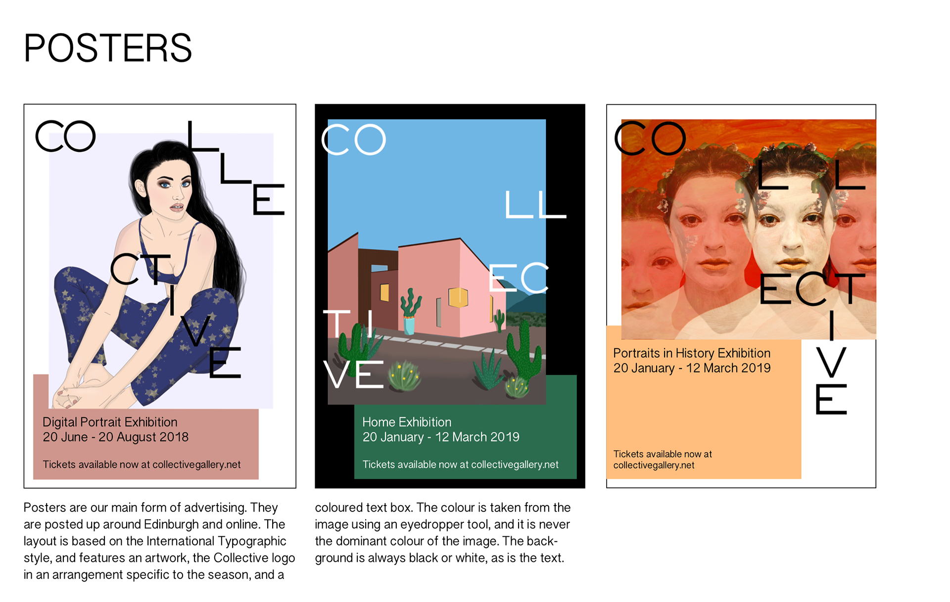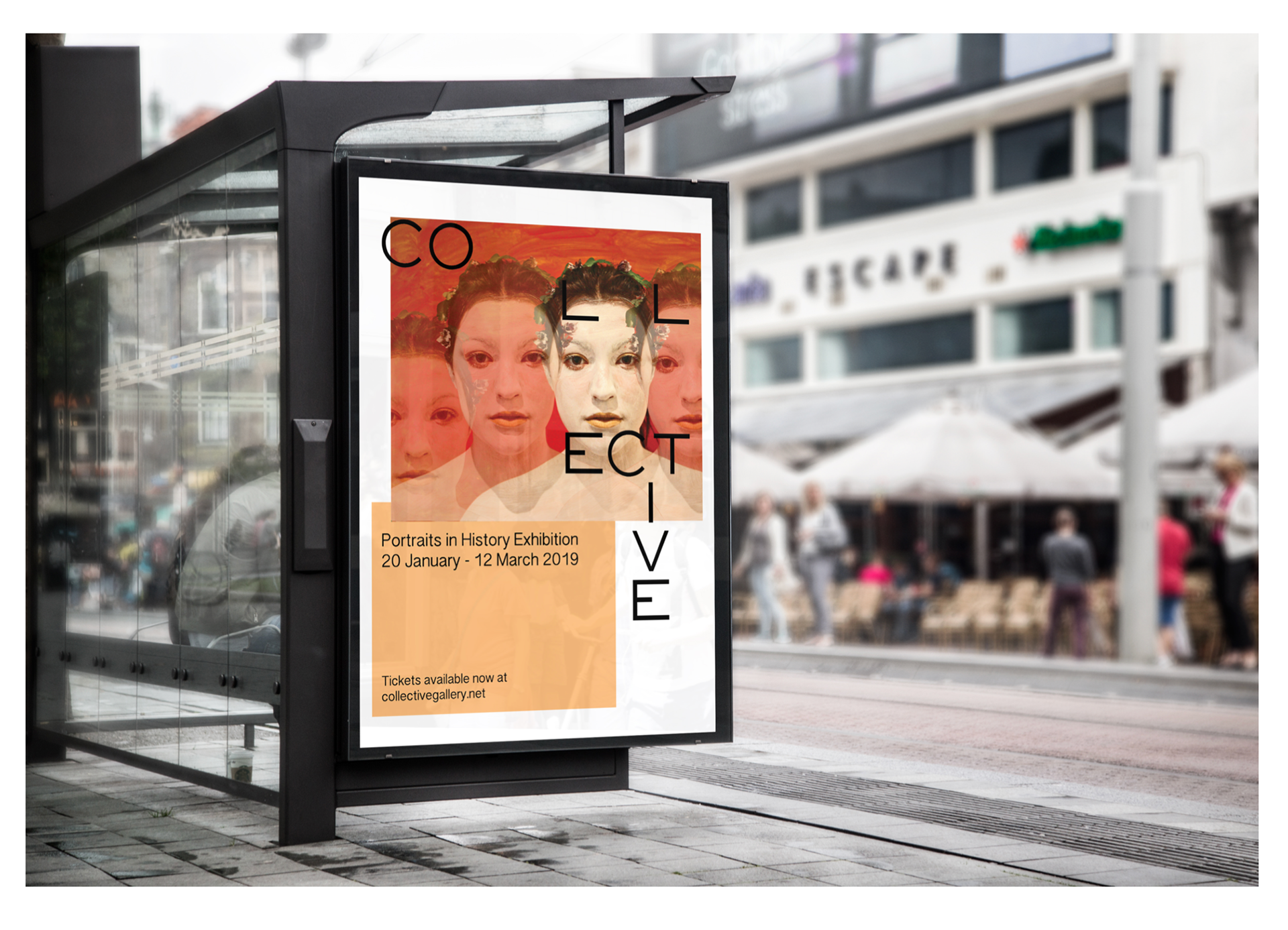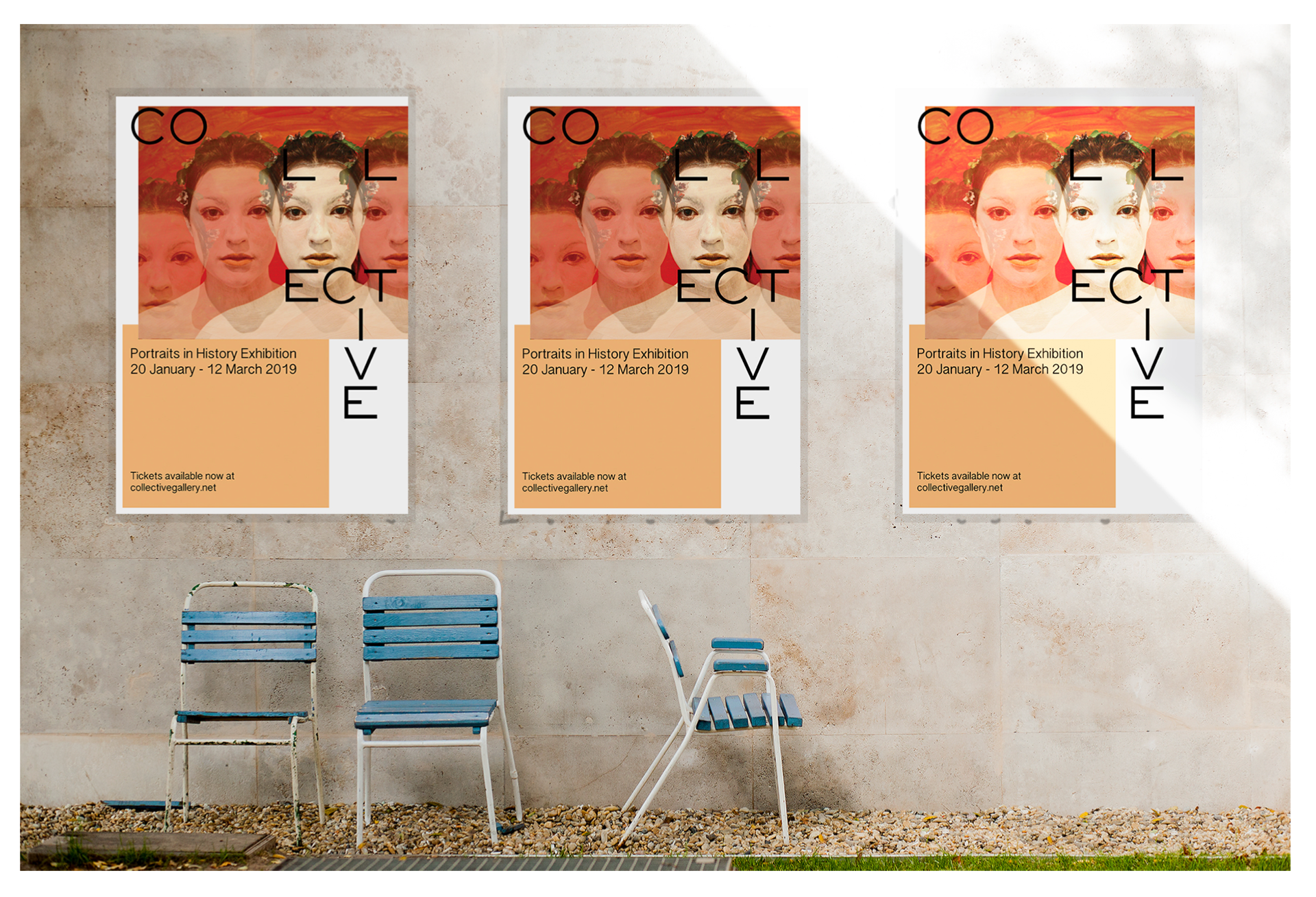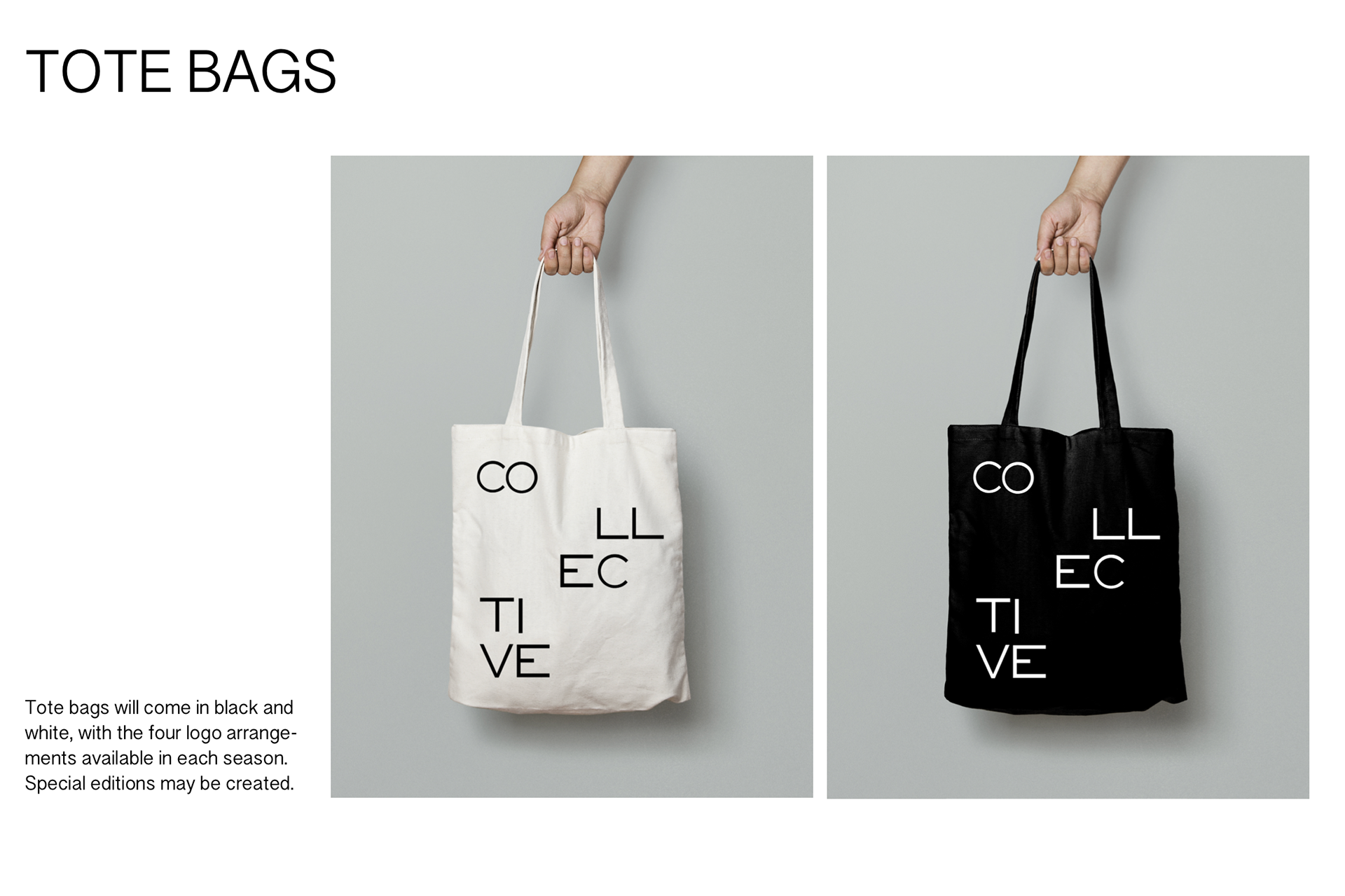
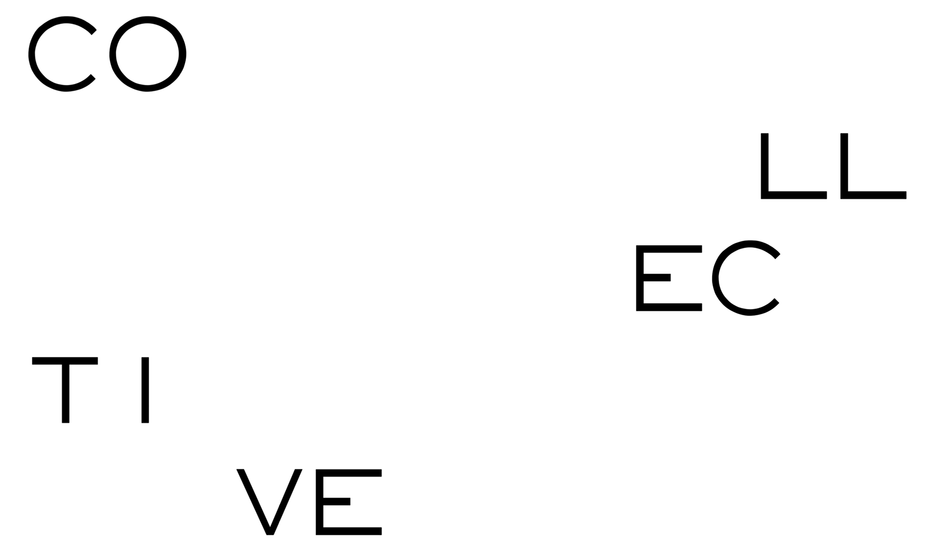
This project was part of Experimental Typography, a class taken in my first semester of my masters degree, and one of my favorite classes to date. We were tasked with selecting a cultural institution, such as a gallery, park, or festival, and rebranding it. I selected Collective, an art gallery in Edinburgh located in the observatory on top of a hill. This gave me a lot to play with, as I created a brand that reflected the observatory location without it being super obvious. I used arrangements of stars to dictate the layout of the typography for the logo marks. There are four arrangements, one for each season of the year, reflecting a key constellation that is prominent in the skies over Edinburgh during that season.